Design Tips for Effective Farm Email Marketing
Email marketing is a powerful tool when it comes to spreading the word about what makes your farm unique, building customer loyalty, and boosting sales. When designing your emails, design can work in your favor, making emails engaging and easy to read, or the complete opposite: make your message hard to get across and possibly leading to potential clients hitting the unsubscribe button. Let’s avoid that! Here are some design tips to make the most of your email marketing and make the time you put into them well worth it.
Set up a design template
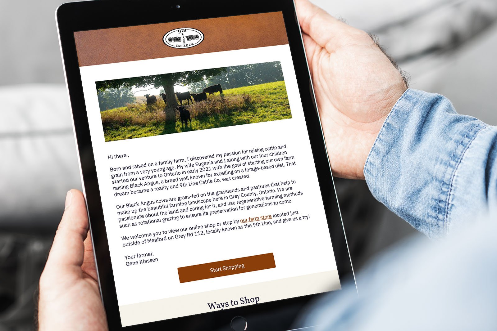
Email platforms such as Mailchimp, Klaviyo, and Drip, allow you to set up a design template, which takes out the guesswork each time you send out a newsletter email or broadcast. With templates, you can set styles from the beginning according to your farm’s branding, including colors and fonts, and build the template around the content you usually include in emails. For example, if you choose to remind subscribers of the different ways they can shop with you in each email (which we highly recommend, to boost sales), you can build that into your template to make sending emails a breeze. Read on to learn more about how color choices play into your template design!
Hone in your brand colors
Using your farm’s colors everywhere you display your brand makes your content easily recognizable amongst dozens of other emails that flow into your subscribers’ inboxes. But we do have one big pro tip when it comes to displaying your colors: less is more! Focus on 3 main colors to use across emails. One should be a lighter color, to help break up sections or make your email pop from the background; one should be a darker color, for heading text and links; and the third should be what we call an accent color, used for buttons and calls-to-action. Warmer colors have been proven to perform better in terms of getting subscribers to click on buttons and take action, whether that’s visiting your online store to make a purchase or learning more about a subject you're sharing in your farm newsletter email.
Focus on one call-to-action per email
“Less is more” strikes again! Experts agree that limiting your calls-to-action to one per email is best practice — it keeps subscribers focused on your one goal for a specific email and avoids the paradox of choice. And what is the paradox of choice? Coined by American psychologist Barry Schwartz, it explains the phenomenon that happens when we offer people, in this case farm customers, too many choices, which then requires them to make more effort to come to a decision and can leave them feeling uncertain about their choice or keep them from making one all together.
For example, let’s say you’d like to promote a back-in-stock product, such as heirloom tomatoes. You can focus your email on a single call-to-action, like “grab yours before the season is over” or “don’t miss out”. That way not only are you keeping customers focused on a single goal (making a purchase), but you’re also expressing that it is a limited-time product which boosts their sense of urgency and gets them to click on the links or buttons in your email.
Looking for ideas for calls-to-action? Check out Drip’s examples and get inspired!
Balance your images and text
Email service providers (think Gmail, Outlook, Yahoo) all have different guidelines to determine whether your farm’s email lands in their main inbox, a filtered folder (such as the Promotions tab in Gmail), or the spam folder — a.k.a. deliverability. While the algorithm can vary from one email service provider to the next, one thing is for certain: balance is key when it comes to building highly-deliverable emails. When putting together your farm’s emails, the goal should be roughly a ratio of 80% text and 20% images.
Please note: when we 80% text, it should be text that someone could highlight and copy-paste from your email, instead of text built into an image.
Put your best face forward
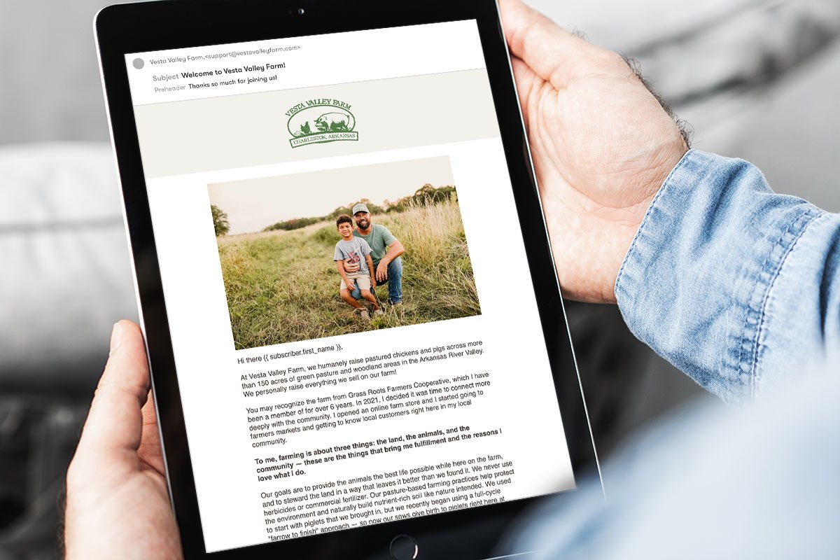
Our experience has found that emails with a personalized signature can make a huge difference when it comes to connecting with your subscribers; they like to see who they're “speaking” to and supporting when making a purchase. Two easy ways to accomplish this can be just adding a picture of you or someone on your team looking at the camera, or adding a personalized signature that includes a headshot of the email signee. In either case, having the person making eye contact with the camera is key; this translates to eye contact with your subscribers and creating a subtle connection.
Text formats are your friend!
When building an email, you’ll notice you can format your text in a variety of styles, such as Heading 1, Heading 2, Normal/Paragraph Text, etc. These styles can make your emails really easy to skim and help break up text, so subscribers can find what they’re looking for at a glance. When it comes to implementing text styles, you should limit your email to a single Header 1 and follow a Russian nesting dolls structure, meaning each style should live inside a larger one. For example:
HEADER 1
Header 2
Paragraph/Normal Text
Header 2
Header 3
Paragraph/Normal Text
Do's vs. Dont's: A visual comparison
Farm email marketing design do’s illustrated above.
Farm email marketing design dont’s illustrated above.
Now take a step back
Once you’ve set up a template, used it to create an email, and are ready to send it out, do one final check:
Does your email represent your farm’s brand effectively and accurately?
Will potential clients need to dig around to find the information they need to take action, or is it easy to find? No need to add all your website’s info into every email, just make it easy to find.
Is it clear what one action you want subscribers to take? Will they feel confident clicking on calls-to-action?
Ready for expert farm marketing support? We’ll recommend the right email platform for your farm’s needs, and make sure it fully integrates with your website platform. Plus, we can set up email design templates, show you how to send emails, and create custom automations to make customer cultivation less of a hands-on process. Contact us to get started!
