Logo Design for Region Roots
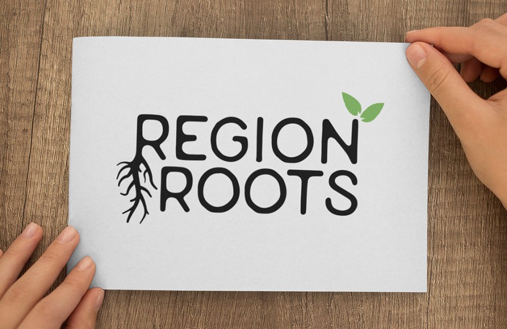
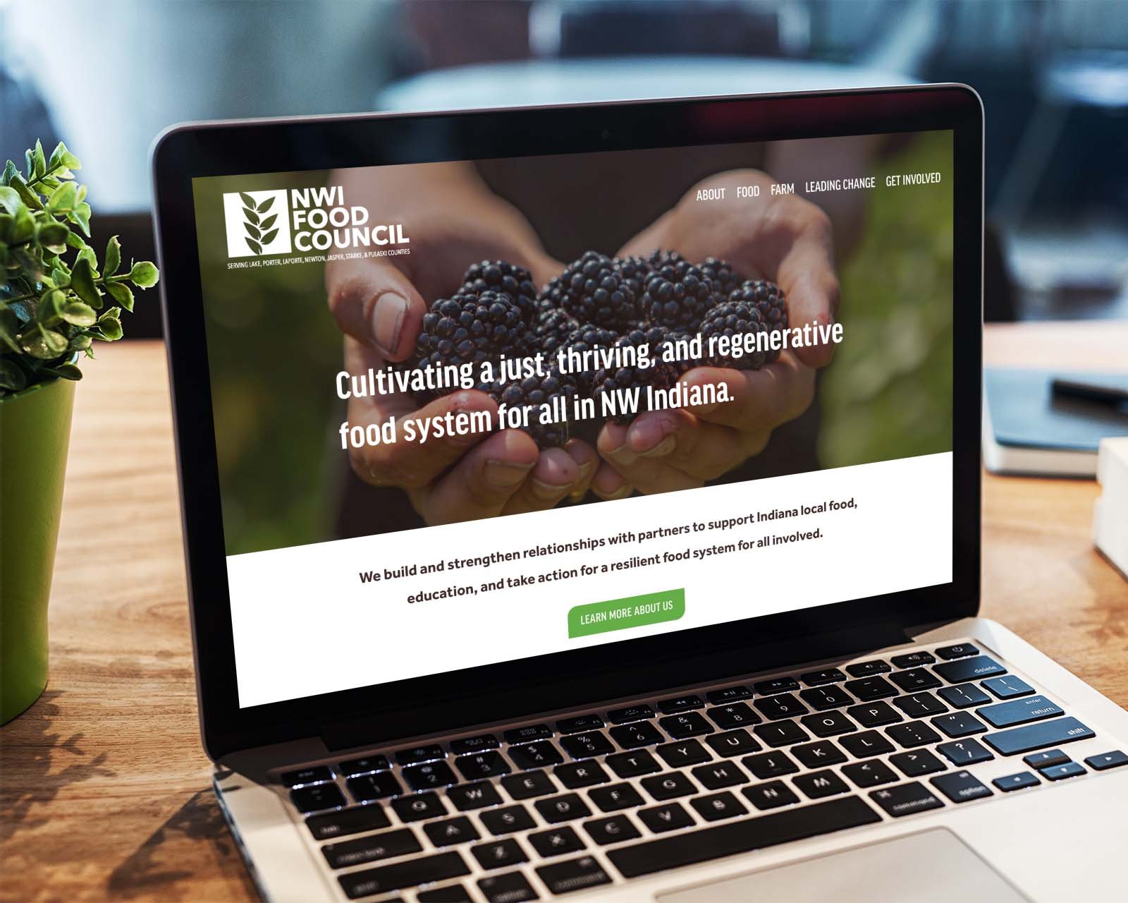
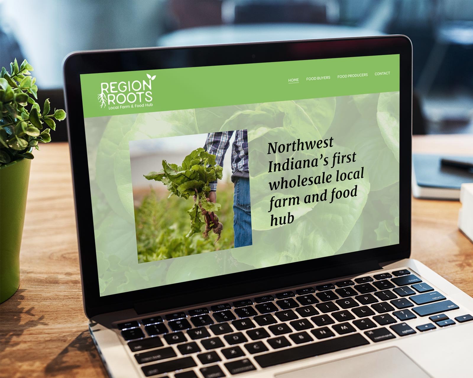
We developed a logo for NWI Food Council’s new local food hub based on organic, rounded shapes while integrating the leaves from the Food Council’s own logo to tie both together. We also designed:
✔️ business cards
✔️ a landing page
✔️ an email newsletter template
“Gabriela, I can’t say enough how much I love the lettuce imagery for the food hub branding. The colors are perfectly in step with the existing food council logo, and they sit alongside each other without competing. And the lettuce evokes this sense of a more organic, 3-dimensional, real life version of the logo leaves — it’s the perfect symbol for the direction that Region Roots [food hub] is taking the food council. The branding so far is beyond my expectations, and it’s giving me an emotional response, which is an amazing accomplishment on your part. Thank you so very much.”
— Emily Scott Long
Region Roots Food Hub (Indiana)
